Aurora Saboir of Aurora Saboir Design shares all about a Bombardier Challenger 350 concept design inspired by the vibrance of the 1960s.
What were your aims and inspirations for this project?
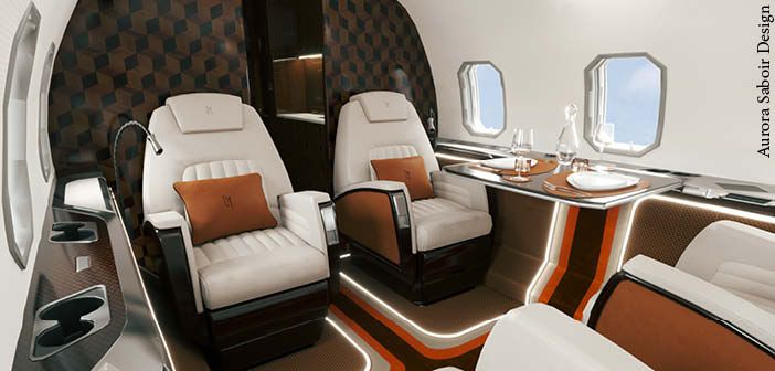
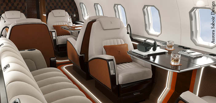
The goal was to present an interior that breaks the usual routine of applying pale greys and smooth tones, by adding extra spice with vibrant oranges and bold patterns.
Can you talk me through the design of the custom elements?
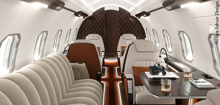
The main and most visible modification in the interior is the re-design of the side panels and the flooring, in terms of connecting them into a continuous surface, by blurring the borders between the vertical and horizontal planes. Both the floor and the side panels are trimmed to highlight the seats themselves, by making clean sections around them. These sections are repeated all the way through the interior, guided by integrated, smooth LED light lines and a pattern inspired by the 1960s. This new way of approaching the surfaces available for customisation resulted in a completely fresh and exciting way of designing the interior.
How would the bulkhead design be created?
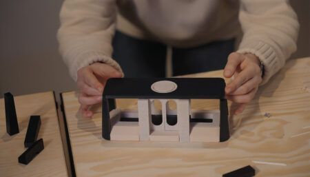
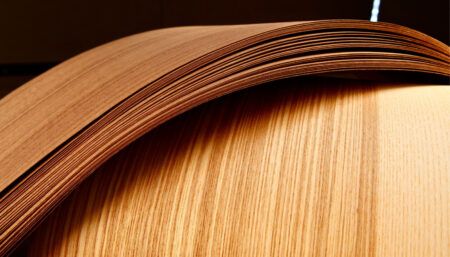
The bulkhead is a three-tone, geometrical veneer composition – the same pattern appears on all wood surfaces, but in a smaller scale. Playing with the scale of the patterns is also an excellent way of presenting a coherent interior in terms of colours and general atmosphere. The bulkhead is a bold centrepiece, however when you take a look at the smaller surfaces and discover the same pattern, the sophisticated continuity and uniqueness of even the smallest details comes alive.
How have personal details been included for the client?
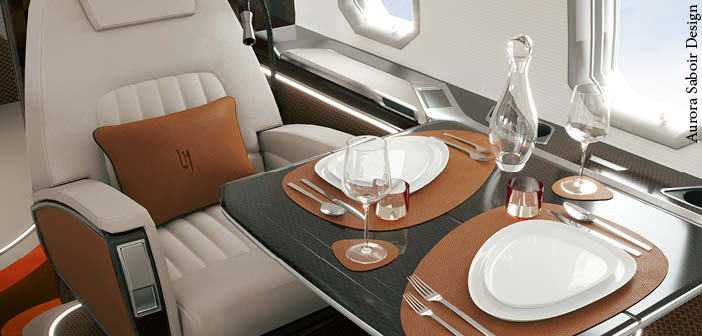
The personalisation in this project was just as important as the design of the general interior. This time the request was to create a ‘Hermés feeling’. Next to the colours used on the seats, carpet and divan, the accessories were the ultimate platform for customisation. Besides the usual presentation of initials, bespoke tableware, cutlery, an amenity kit, bathroom essentials, soft goods and fabrics were designed to create an overall onboard branding experience. Jets are flying statements – the perfect surface for presenting an identity, a message and style. I have had the opportunity to work on various branding projects even before getting into aviation, and seeing the possibilities for onboard branding is definitely going to be a service – just as important as interior design – for future projects as well.
Are there any other details you’d like to draw attention to?
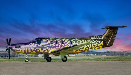
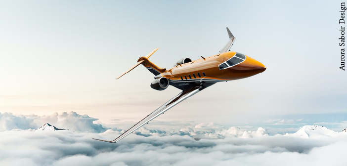
The livery follows the style of the interior, to create and maintain the wow factor during the whole flight experience, over and over again. The livery is another excellent surface for presenting unique designs and showing dedication to the details.
What would be the most challenging elements to realise? Are there any that require further development before implementation is possible?
The most challenging part is the re-configuration of the floor and sidewall elements, because those surfaces need more engineering and technical support before implementation. Since the design itself was an absolute success, we are working on the precise definition of these modifications before execution.
What’s next for the project?
The project is a finished concept design, currently at the phase of further technical development and detailed definition of the elements.
Aurora Saboir Design will detail another design in the March/April 2022 edition of Business Jet Interiors International.
Images: Aurora Saboir Design


