Designed to be used for multi-leg global tours, the World Cruiser offers memorable spaces for learning and socialising, in addition to full-flat seating for 80.
The World Cruiser concept is the result of a collaboration between Tom Chatfield, CEO of Camber Aviation Management, and VIP aircraft interior designer Tim Callies, head of Callies Design (Callies Gräfe Design during the project). The pair took on the challenge from an undisclosed client looking for a jet to take groups on four-week tours around the world, in the same vein as Four Seasons with the Black Pearl aircraft. “They gave us quite a lot of latitude; they didn’t tell us an aircraft type, but said they would like to do this ‘better than Four Seasons is doing’,” shares Chatfield.
They decided on an aftermarket Boeing B777-200ER as the airframe, because their research showed “there was a number available; they have an extremely long range; a very, very large cabin; and the price point is very, very attractive,” says Chatfield.
“Since the client was price-sensitive, we were able to put together a programme that would be achievable under US$80m; they were quite happy with that,” he adds.
Next they assessed what was memorable about Black Pearl, and what they thought they could do better. “What’s outstanding with Black Pearl is that you have full-flat seating and you travel with a small group,” says Chatfield. “What’s missing is the ability for people to get together in a lounge-type atmosphere to enjoy one another’s company.”
Imposing entrance
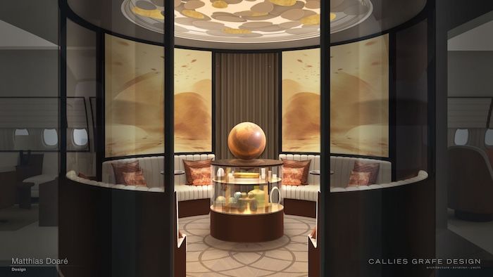
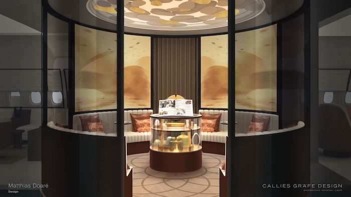
In creating a “kind of flying cruise ship”, Callies’ first task was to create impact in the main entrance area. The focal point is a group of benches arranged in a circle, surrounded by a circle of curved screens onto which artwork could be fixed, or scenes projected (using Diehl’s technology for example). There is a ceiling dome above, with indirect lighting. In the centre is a vitrine (an enclosed case with transparent sides) that could be used to display mementoes from stops along the tour, or goods to buy. These loose items would be sufficiently secure so as to pass certification, Chatfield notes: “We’ve already done the review, this whole thing is relatively easy to certify. There’s nothing that can’t be built at this stage.”
A more speculative idea is to place a globe on top of the vitrine, using magnets to ‘float’ it (with a capture mechanism in place for times of turbulence) so that it can be moved around. The aircraft’s position could be shown on the globe, projected onto it from outside, or from within. The spot could also be taken by a book stand instead.
Explorer Lounge
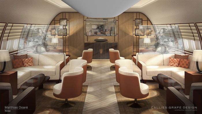
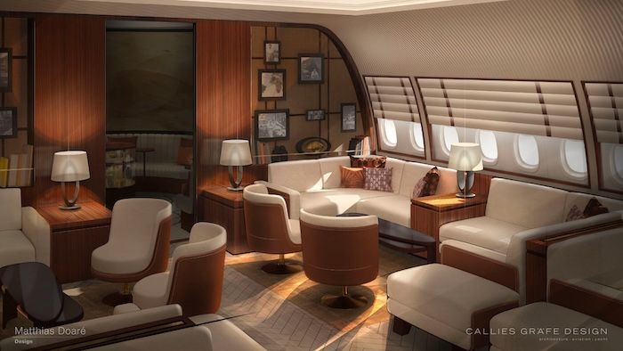
Forward from the entry area is the Explorer Lounge. Here groups could be invited for briefings, for example where the tour guide or specialists would talk about the next destination, making use of a big screen. The space could also be used for other meetings or socialising.
Aesthetically the aim was to reflect the company’s history and balance classic and contemporary design beats. “It’s a club feeling,” sums up Callies. “We created contemporary language for the seating but classic walls with a wood and textile mix, featuring pictures that can be exchanged, depending on the destination, easily.”
These pictures are affixed with magnets and can be stored inside the buffet. The mood can also be switched up by exchanging pillows and blankets. “You will change the mood with little decorative elements without changing the upholstery,” says Callies.
There are four groups of seats comprised of U- and L-shape sofas plus lounge chairs. The seating in the lounges and entry area are not TTOL-approved. “This gave much more flexibility to make it really cosy looking, and have seat structures that aren’t massive,” says Callies.
Movable ottomans
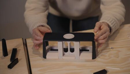
There are also ottomans, shown at sofa ends. Each is anchored at the bottom but the quick-release mechanism enables the unit to be untethered. “The ottomans can be taken out easily and put wherever you would like so that if somebody wants to join a group, and the seats are taken already, they can just release an ottoman and roll it over,” says Chatfield.
Flooring is a mix of tactically placed carpet and non-textile floor with a herringbone wood effect in areas where durability was more pressing. For acoustics, Callies included as much soft material as possible – for example soft wool fabric on bulkheads.
Proposals were created for different budgets – the standard, then one with VIP window linings, also designed for acoustic advantage. Another idea is to have pop-out electrochromatic divider screens that can be changed from clear to opaque.
Library Lounge
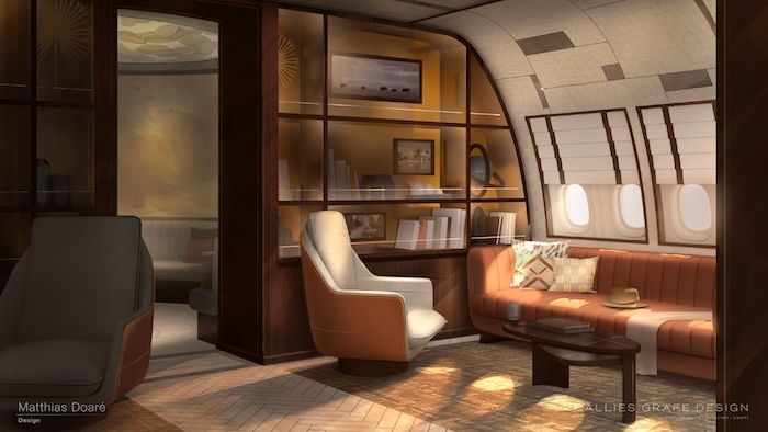
Aft from the entryway is the Library Lounge, intended as a more private area, for maybe two groups of two to three people, with a sofa, a stool, and a self-service mini bar. Again the chairs and sofa are not designed for TTOL, but Callies says “if the customer had asked for TTOL, the design could be very close to this one”.
The library aspect is fulfilled by bulkhead shelving units, stocked with books related to the next destination. The shelving front is wood; inside could be finished in gold leaf or bronze. The shelving is open but with bars to keep books in place. “We wanted an open bookshelf, not closed with glass because then it’s not easy to access,” says Callies. “Artworks could be fixed to the shelf but since the idea was to exchange the books by destination, for TTOL they need to be stored underneath.”
Business-class
The other sections of the cabin have not been fully illustrated, as the focus was on presenting lounge designs to the customer, who already knew the business-class seats that would fill the bulk of the aft section, across two areas. The first has 36 TTOL full-recline seats, the second has 24. They are in a 2-2-2 configuration.
To keep costs down, and as a more sustainable measure, the seats would be sourced from an airline, refurbished and customised for the World Cruiser. “We already talked to the airline,” reveals Chatfield.
There are small movable benches/ottomans at every seat. “It allows someone to sit there to talk to you and when you put the seat flat, it becomes an extended sleeping surface,” says Chatfield.
The ottomans are also a place for passengers to store carry-on bags; there would be no overhead bins.
Next steps
The pair say the concept is entirely feasible. Chatfield thinks the only possible challenge for completion centres could be that they aren’t used to upholstering 80 seats at a time. As for whether it will go ahead, he says the client is “looking at what their plans are in the next three years, and whether they will then incorporate an aircraft of this size or not”.
Chatfield adds that the concept also has other possibilities; for example, the aft 24-seat section could be replaced with four suites to suit a touring band, still leaving room for an entourage. Or the middle section could be swapped to add four suites with a bathroom each. “You’d have some pretty cool lounges in the front where you could relax, practice and do what you’d like on your way to the concert,” he says. “With the cargo hold down below, there’s more than enough space for your equipment. We have to speak to Taylor!”
This feature was written by Izzy Kington and first published in the July 2024 edition of Business Jet Interiors International. Click here for the full version.


